Get in touch
sreesevithaami@gmail.com
Product Design
Case Study
a platform designed to simplify news consumption for Gen Z by offering personalized, bite-sized content that is both engaging and accurate.

Project Overview
In today's fast-paced digital landscape, Gen Z faces an overwhelming influx of disorganized news content. Through conversations with young adults across different regions, we uncovered that many in this demographic find it challenging to stay informed about current events. The lack of tailored news platforms and clear guidance on navigating various sources often leaves them skimming headlines or relying on social media for their information.
Problem
My Role
This project marked my first venture as a UI Designer, where I took charge of User Interface Design and UX Research, while also spearheading the business strategy and design system. My role involved leading a dynamic team of designers and strategists to create a product that resonates with Gen Z's unique needs.
-
UX Research Lead and UI Designer.
-
Project Management
Timeline
10 Weeks
Carlos
Shruti
Sree Sevithaa
Tanishq
Team Members
Figma (Wireframing, Prototyping, Branding)
FigJam (Brainstorming, User Flows, Affinity Mapping)
Miro (User Research, Persona Development)
Adobe Creative Suite (Premiere Pro)
Maze (User Testing)
Canva (Presentation)
Tools
Product


Product
The Tea offers an end-to-end solution that not only curates the most relevant news stories but also presents them in a way that is both accessible and engaging.
CORE FEATURES
-
Personalized News Curation: Tailors news stories to match individual interests, ensuring users receive the information that matters most to them.
-
Bite-Sized Content Delivery: Presents complex issues in short, easy-to-digest formats that fit seamlessly into Gen Z's fast-paced lives.
-
News Engagement: Includes interactive features like polls and discussion boards to foster deeper connections with the content and the community.
-
Accurate News: Employs verified sources and rigorous fact-checking to deliver trustworthy information.


USER RESEARCH
Understanding Our Audience
We focused our research on understanding the behaviors, preferences, and challenges faced by Gen Z when it comes to news consumption. Secondary research revealed that Millennials and Gen Z are increasingly relying on social media for news, often at the expense of comprehensive journalism. To dig deeper, we conducted interviews and surveys with young adults, aiming to uncover their pain points and motivations.
.png)
.png)
.png)
.png)
.png)


Through our interviews, we discovered that while Gen Z values staying informed, they often feel overwhelmed by the sheer volume of information available. This insight reinforced the need for a platform that not only curates’ content but also presents it in a way that is easy to digest and engaging.
AHA Moment

Competitive Analysis
We also conducted a competitive analysis of mainstream news apps targeting Gen Z. Our goal was to understand their target audience, Gen Z appeal, content focus, engagement features, personalization, accuracy, and moderation, in order to discover potential opportunity areas for our product.
.png)
.png)
.png)
.png)
Strong local engagement but limited personalization and potential for misinformation.
High accuracy and curated
content but lacks user control
and engagement.
High Gen Z appeal and engagement but focuses more on entertainment than news.
High personalization and engagement but variable content accuracy.
IDEATION
How might we make news consumption more intuitive and engaging for Gen Z?
We used the "Jobs to be Done" (JTBD) framework to guide our ideation process. Each team member contributed their ideas based on the research insights, and we grouped these ideas by their relevance to user goals.
We then used Crazy 8's—a rapid brainstorming technique—to generate innovative feature ideas. The most promising concepts were refined through affinity mapping and blind voting, leading us to prioritize the features that would deliver the most value to our users
The JTBD framework proved invaluable in keeping our solutions user-centric and goal-oriented. It ensured that every feature we prioritized was aligned with the core needs of our target audience.
AHA Moment
Low-Fidelity Designs:
The low-fidelity designs provided us with the first glimpse of how our app could potentially work, with all the key functionalities implemented.


Blue OCEAN STRATEGY
I.A. CoMPETITOR ANALYSIS
How do we analyze competition for information architecture?

a. Navigation
b. Labelling
c. Sense of Place
d. Visual Cues
e. Sign Up & Onboarding Confirmation & Error States
f. Content & Content organization
g. Features
h. Flows
i. UI
j. Business Model
k. Overall User Experience
We used Blue Ocean Strategy to look at direct and indirect competitors to focuses on creating an untapped market space by offering a personalized, intuitive, and engaging news platform tailored specifically for Gen Z.
I.A. is the way to organize and label the content and features of our product to help users find what they need and achieve their goals. We analyzed the IA of our competitors to help us identify their strengths and weaknesses, learn from their best practices, and find opportunities to differentiate our design.
Consideration:

The Tea stands out in areas such as features, content organization, and user experience, outperforming competitors by simplifying news consumption and integrating interactive elements that drive deeper engagement, as shown by its strong positioning in the chart.
INFORMATION ARCHITURE (I.A.)
Gen Z (Explorer) I.A
Bottom Up
Reporter I.A
Bottom Up
I.A. starts with people and the reason for a product/service.
People act on information needs through info-seeking behaviors. Understanding needs & behaviors is critical, and will shape our app's design.

Visualizing I.A.
Our approach was Bottom Up I.A., A Bottom up I.A. structure develops with content.
1. Where am I?
2. How do I get around?
3. Can browse by date, location, subject?
4. Can search by date, location, subject?
6. Allows to share content with others?
We formulated these questions to help develop the backstage parts of IA, which are not easily visible/recognizable, especially through an individual screenshot.

IDEATION
Mid-Fi Screens:
Primary Navigations
Mid-Fi Screens:
Secondary Navigations
The landscape Shift!
When you cross the bridge from research and strategy into design, the landscape shifts dramatically.


Homepage
Discover
Notification
User Profile

Timeline
Full Article
Explain it
Clink
IDEATION
Wireframe Library

Note: These are only 1/3 of the medium-fidelity wireframes
PROTOTYPING AND TESTING
We utilized heatmaps during user testing to visually track user interactions and identify areas of engagement, helping us optimize the interface for better usability.


PROTOTYPING AND TESTING
User Testing Day 1
Major Improvements + Design Decisions
In terms of the actual high fidelities for launch, we conducted user testing throughout the process with my team, our professor, users, and Reporters . I'll be discussing the three major improvements/design decisions we implemented to satisfy the user needs and brand identity.
In-app Onboarding
After our first round of user testing, we discovered that users were struggling to understand the various features of the app. To address this, we implemented an in-app user onboarding system.
Our user onboarding specifically guided individuals through the features and functionalities of the app, making it easier for them to navigate and understand key elements like the Clink feature and the tea logo.
This personalized onboarding experience significantly reduced the time users spent figuring out tasks, improving overall usability.
.png)
User Testing Day 2
Iterating News Article Interaction
During our second round of user testing, we focused on refining how users interact with news articles. We introduced the "Clink" feature, allowing users to connect based on shared news content, and implemented a multidirectional swipe feature to enhance article navigation.
Users could now swipe right for articles they liked and swipe left for those they weren’t interested in. These updates aimed to improve user engagement and personalization, making it easier for users to connect and navigate the app intuitively.

User Testing Day 3
Enhancing User Profile & Badge Visibility
In our third iteration, we focused on addressing user feedback related to profile badges and improving the overall user interface. Users were unclear about how to earn badges and found the existing navigation elements distracting. To resolve this, we highlighted the badge section within the user profile.
The updated profile now clearly displays earned badges and provides a preview of future badges users can unlock through app interaction. This enhancement ensures users have a clear visual representation of their achievements while making the navigation smoother and more intuitive.
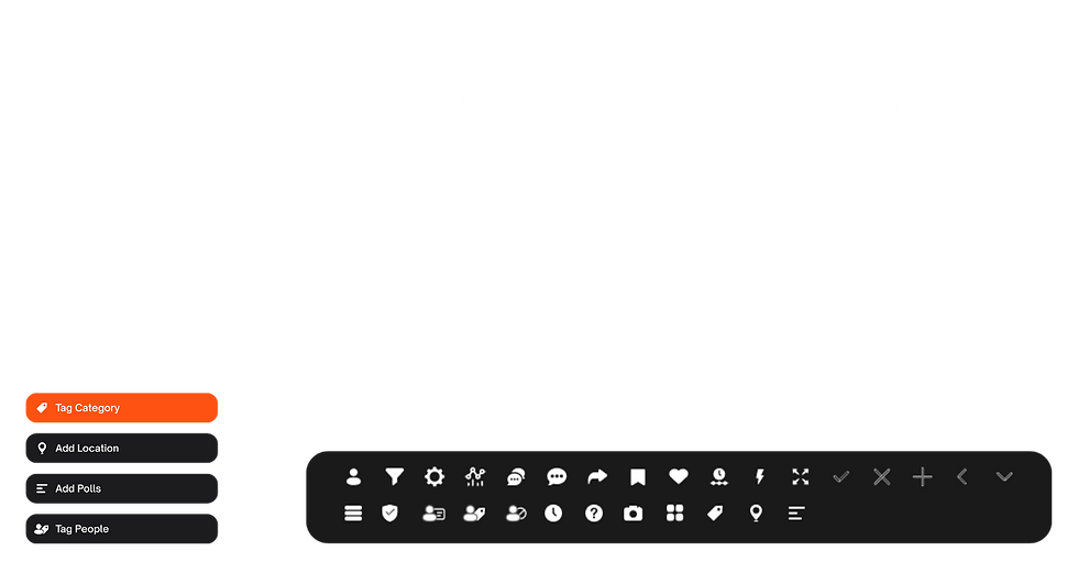
UI Kit
Brand Guidelines
Throughout the design process, I worked closely with other designers to integrate our brand identity into the design system. This included developing a consistent visual style, tone, and user experience that resonated with Gen Z. The balance between auto-layout for efficiency and manual adjustments for precision was a key learning experience, allowing us to iterate quickly while maintaining design integrity.

The Tea Business Model

Key Takeaways
This 10-week project was a whirlwind, but an incredibly rewarding experience as part of my Information Architecture class. I truly enjoyed collaborating with my team and professor. Reflecting on my growth as a designer throughout my master’s program, I’ve learned to apply technical skills like auto-layout, grids, and design systems to create more structured and consistent designs.
I also grew as a UI designer, particularly through prototyping and user testing. Understanding how users interact with buttons and features is very different from what we might expect as designers. Testing during the Mid-Fi stage proved invaluable in refining the design system, reinforcing the importance of "prototype, test, iterate" — a stressful but ultimately fulfilling process when those beautiful, functional solutions come to life.